


19/11/2015
This week we had to come up with different ideas to create, at least, three labels for jam, juice and ioghurts. These labels have to be related with food, concretely with fruits drawn by us. Even not being mentioned, visual coherence can be implemented. However, the main purpose is continue investigating the software (Photoshop & Ilustrator) rather than providing a realistic label.
Moving into context, I changed the task to work on a different way. In previous tasks I put almost all my efford on the graphic part developed by hand (drawings). This time, though, I based my work on three simple own drawings of three berries created in less than 5 minutes.
INITIAL:
ANAGRAM:
GRAPHIC LOGO:
The evolution of the idea is often more important than the result by itself. Sometimes those sketches that you thought are horrible end being those who someone buy! Thus, showing the entire process of the evolution, incluiding sketches and advanced ideas, are required to be in this part.
LOGO:
PICTOGRAM:

SIGNATURE:
MONOGRAM:

18/09/2015
How can we display numbers uing only cardboars and light? There is no easy answer, but what if I try to make a lot with a few?
The structures where thought to be as simple as possible, to increase the sense of surprise when irradiated.
It's just fantastic to see how three blended cardboards, aparently unrelated, display every single number from zero to ten. In addition, the coloured shapes versus the shadowed grey number creates something curious, a strange but pretty contradiction.


Ten numbers using three shapes


Ten numbers using three shapes


Black cat done using watercolours

25/09/2015
Using watercolours, imagination and some software, we are asked to to create a book front and back covers. Any other restriction is given.
I chose The black cat, the famous story by Allan Poe. To create the covers I try to be synthetic; I don't want to recreate a lot of thetails in them, I just need to share Poe's fear. Enough to sell a book.
Black allows me to show evil, not only the animal. However, using white, I focus on the story's contradictions. How can a cat ruin your entire life?


The base
The base

02/10/2015
This time we have to develop an entire CD (front, back and interior covers) for a music group. As always, nothing else but watercolours, imagination and software is given.
I chose a recent album of an iconic group, Viva la Vida by Coldplay. Lauched in 2008, its single, Viva la Vida, wanted to show how important it is to fight for our liberties and rights. So, inspired by the Frech Revolution, Coldplay made a song -and an album- dedicated to all of those who believe in freedom, life and human rights.
So, what did I do? I redefined the covers using the same base idea, the revolution. By implementing three colours: green simbolizing hopeness, pink (or soft red) for revolution and blue for a pleasant life I try to represent the proces of achieving our liberties. The powerful black hand shows that we have the power. Rights and liberties don't understand of either languages or nations, they are universal and it is in our hands to reach them.
In the interior covers five human rights strictly related with the freedom and life are writted down to encourage the costumer to pursuit them. Music, represented as an equaliser, reinforces its power to carry all of our thoughts.


02/10/2015
This week we have to create the front cover of an architectural magazine. The idea is to draw a nice perspective of the interior -or exterior- to capt reader's attention.
I look for many examples in order to get inspired until I find Disseny HUB. Located in Les Glòries Square, in Barcelona, it's considered an icon for both architects and designers. Inf act, the building is the Design Museum of the city.
Even though the exteriors are so eye-catching, they are so known. What about making a picture of the interior? Is it as relevant as the outdoors? Yes, of course; big spaces, light and fat-free shapes are beautiful by itselves, but there is one curious part: LEDs on the roof. Disseny HUB's biggest room has an entire LED instalation all over its roof, making the space look completely different depending on the hue.
So, I try to capture these LEDs in blue. Walls, floor and columns -originally white- capt all the color and transform the space into a suggestive sea. One point perspective, triangles and transparencies are used and combine to make drawing and the cover.


16/10/2015
This week we have to decorate of a kraft bag for a company. Even though it's not part of the briefing, it would be great to integrate both bag shape and decoration. The idea of creating an own company or choosing a real one is up to every one of us.
Looking for some inspiration I saw my umbrella, which brand is Isotoner . Going deeply into it I discoverd some models thought to prevent crashes when winding. This models, coded as X-tra solide, gave me the idea of developing a commercial bag focusing on this feature. On one side I would refer to the umbrella's lightweight and on the other on its resistance.
The idea of using the hande as part of the bag came to me at the very beggining. On one cover I collocated a closed umbrella just to ensure that the bag handle would look like the umbrella's handle as well. Moreover, a blue sky would evoque the idea of a sunny day. On the opposite cover, though, I put a semi-closed umbrella surrounded by a dark blue sky. This part wolud be key, as it wolud gave the idea that the umbrella never breaks, even after heavy rain and winds.
I though in a short and quite symetric slogan "From home in one piece. Back home in one piece." to provide a better explanation of why X-tra Solide is a good choice. Finally, also foccusing on selling, I collocated parts of the four Isotoner X-tra Solide models actually on sell.


04/11/2015
This week we had to come up with different ideas in order to develop isotypes, a logo and a imagotype. In total, seven elements had to be made. Even not being mentioned, visual coherence could be implemented. The main purpose, though, was on the final results, rather than showing the graphic evolution.
Just to set the context, the main idea appeared when I saw a plug at class. It was pretty simple and I told to myself -Why not? I wanted to develop something simple that could work without extra explanations and the plug seemed to be a perfect base. Then, I invented a strong and reliable name: Olsson Electric. This nordic name ensured a high reputation brand. By introducing letters such as the "O" or the "E" I colud play with meanings, I mean transform letters into objects.
Typography was a key part of the design, it had to fit perfectly. I chose Bauhaus 93 due to its thickness, curvy lines and its "o". That "o" Impressed me so much that I used it in almost every element. The only two wich did not include it were the signature (a combination of free-hand and StinkontheDeath and Art Brewery typographies) and the pictogram. This last one emulated both a wall plug and a face using the least possible elements
Finally I selected the colours: blue and orange. Dark blue showed the reliability and strength that every big company needs, meanwhile orange introduced a human point based confidence and friendship.


F1 sponsorship

Pollover label, why not?

Logistics truck

City advertising

Safety first!

Approved!

Going shopping?

Warm and cool

Just cool

Tea time!

Not only plugs...

Shop signal

Merchandising

WRC sponsorship

Delivery always on time!

More shopping!

Want a business card?

Black or white?

Wine bottles

Another mug...

Realistic imput
As I said, the object of this essay is evaluating the final results. By introducing the different elements in scenarios we need to both learn to create a photorealistic result and evaluate its viability. The relation between Olsson and the objects showcased on the photographies are not always strict, they are just experiments. It is not common to see an electrical company on a hoodie, but if it fits great, woludn't you buy it?
Three photos per element are showed, making atotal amount of 21 pictures:

Adding sense
Adding sense


So, once I had my drawings defined I started thinking in different ways of coolocating them. However, before drawing anything came up with a pretty different idea: drawing fruits using only their outlines. I did, in fact, serveral tests, but the result did not convinced me.


As soon as I knew that I wouldn't use outlines I imagined how would I put my drawings. A product range appeared to be the best idea to maximise my fruits' potential and to offer better labels. It would clearly increase my work charge but that was exactly my purpose: simple drawings & multiple labels
Now, I will give further details of the evolution of every range of products made:

A really simple idea with the fruit having he main rol was my inspiration. I didn't want to make anything superb, or even inedit. I just wanted it to look simple and eye-catching. In addition I would use a green band to evoke the plant; looking natural is the key of any product

I develop the following prototipes. At first they seemed to be good enough, but typefaces used made it look too old and far away from the idea of a fresh brand that I was pursuiting. I used the three last ones in the final jar just to imagine how it wouold look.

Pretty simple

Too much red

Pretty simple
The final result was really similar to the three last images. However, another typefaces where nacessary. By doing a little facelift I achieved the purpose. Offer three labels which clearly define a young, natural and active brand.


Another simple idea with the fruit also having he main rol was my inspiration to start designing this labels. In order to use the three labels, I focused on a gourmet range of products. They allow me to introduce extra elements, basically different colours (golden ans black, mainly) and develop a product that is not commonly seen. How many gourmet ioghurts have you seen?
Using black as the main colour was temptatig and almost compulsory for a gourmet product. It looked so dark, thuogh. However, the fruits added the so needed touch of colour maintining the style. The brand isotype addapts to every range of products; here adpots golden and silver tones, both necessary to share confidence and quality.


A gourmet ioghurt is not easy to develope. The final result introduces several improvements, mainly tipefaces that avoid misunderstandings with the kind of products. Colours are slightly revised as well. In addition I try different colours on the surface of the ioghurt. Surprisingly, silver seems to be the most adecuate.

Creating them was rather more difficult. I looked at many examples to get some inspiration but with the intial logo the results were too heave, ugly and didn't invite you to buy the juice. In fact the redefined logo is the consecuence of the poor results that the other offered in a can. The sketch has been semplified, but in reality it was full of other minor details:

The first attempts are rather different than the other ones. Here is clearly visible the approach tha I was taken. The large number of ideas, all based on the same are a great example for stopping and thinking when realising you are not working on the right way.


FInally, I sttoped for a while and simplified my thoughts. The initial idea was cool but labels contained too much information. Googling famous cans is easy understanding what I mean. What cans share are simple ideas with simple shapes.


LABELS
27/11/2015
This week we had to invent different labels for ay product we could imagine. Even not being mentioned, visual coherence can be implemented. However, the main purpose is continue investigating the software (Photoshop & Ilustrator) rather than providing a realistic label. Moving into context, as in previous practices I opt for simple drawings, no more than three per label.
I work on labels for Wine, for coffe and for a light bulbs box:
WINE
Doing a label for wine seems to be an easy task but it is not. There are lots of different desings and creating one as eye catching as the ones you see on the net takes time. The key factor i the brand, in this case Mas Egarenc, a common word used in Terrassa, where I study. Using Mas I try share the idea of a genuine, natural and handmande product, all key to sell a small Wine. Moving to the graphic content of the label we can see three main parts, the back ground, the grapes and the plant. All three elements have been originally made by hand and optimized with Photoshop.

Once I had the drawings and the main idea I concreted it:


Finally all the variations and the final render:


LIGHT BULBS
I used the brand Olsson that I created one month ago to introduce a label. However, my idea was a bit more complex. Finally I decided to do more than one label maintaining simplicity. I played with both corporative colours, blue and orange, and designed a complete packaging for two LED light bulbs. The blue or orange lines, depending on the verision, represent a lightnin. I only draw two basic figures:


Once I had the sketch and the main idea, I concreted it:

Finally all the variations and the final render:


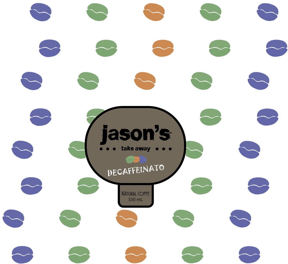
COFFEE
For creating this last label I wanted something really simple. Developing a label for a paper cup, similar to Starbucks, seemed to be a reat idea. So, I invented a brand, Jason's, and drawn a bean. Rather than playing with more complex shapes I used the same bean creating a colorful pattern. Colors chosen have been blue, green and blue soft tones to increase modernity and, at first, to denotate difference between products.


Once I had the sketch and the main idea, I concreted it:

Finally all the variations and the final render:


POSTER

11/12/2015
For developing this task we needto creaete a poster that can be converted into a paper chair. Why using furniture? Because we are announcing a chair desing challenge. In our posters the only cumpulsory information must be our university logo, and some text indicating what's going on. Both the poster and the chair desing are free. This time we have also to phisically create the chair. As always the main purpose is continue investigating the software (Photoshop & Ilustrator),
I tried to work without sketches, just imaginating and bending the paper. Though this method made me feel unsafe at first, a great idea came to me pretty fast. It consisted on bending a piece paper in order to create the shape of a Gmail envelope. Cool, right? Sure, but the connection chair-Gmail was soo por. Finally I dismissed it but i continue working on the same way.
EVOLUTION

Using triangles as a background was a very initial idea. On the chairs of the left, the ones with the red stripes, I tried to combine different colours and, as I said, the envelope og Gmail. As soon as I realised that the main idea wasn't that great I simplified the desing using only one base colour and introduced all the necessary text units. Different final resoults are shown:
DIFFERENT RESULTS


MODEL


ADVERTISEMENT
free practice
31/12/2015
This last week we are free to develope whatever we want. While It seems to be easy, it really isn't. Working without clear purpose is often toughest than guided jobs. We have touched almost every single aspect of graphic design so far, however we have never been told to sell a product. So, focusing on the automotive industry, one of my hobbies, I'm making an advertisement for Citroën.
Citroen is well known for their fashionable designs and risky desings. One of their most iconical vehicles, the 1955 DS 19 inspired the XXI Century DS luxury subdivision. Maintaining the taste for good desing and passion for technology in 2010 appeared the DS 3, a redefined urban vehicle. Now, in 2015, it has received a facelift. New headlights catch my eyes.
First of all I identify the car and inspectionate both head and taillights. They are absolute superb, -why not using them as the main point of the ad?- I ask to myself. It's not necessary to show the entire vehicle, new LED lights are so much attractive. Other details, as the interior Paris skylyne vynil can be intereting as well.
LOOKING FOR KEY DETAILS

SKETCHING
In order to be fast I follow the same method used in previous works, starting with a few simple drawings. These are sketches of the tail lights, the front lights and the side of the car. Further Photoshop edition allows me to implement different filters, change colours and make images more attractive.

SKETCHING
OUTCOMES


ADVERTISEMENTS ALL AROUND


In every combination I tried to use the adecuate colours and typefaces, so it would look like a real Citroën advertisement. Magenta colour was really key to achieve it. In addittion, the black backgroud reinforces the brightness I've been pursuiting. The main figures, representing the lights, are so imaginative and that's the key of the message. I want the costumer to ask himself -how can this be in a car? Both the QR and the hashtag will provide him all information he needs, but i just want his reaction.
The slogan Light reveals you is not new; in fact is the one Citrën uses for announcing the DS 3 in the UK. Implementing it is just another point of realism. In addition is a great slogan for my idea. Increasing you dimensions is key for the public. It's so claerly visible and it seems to be comunicating with someone.
The Paris Skyline is more tan mere decoration. It represents its most famoust seightseeings, the DS 3 among them. It gives the product the desired rellevance and shows its jungle, the city.
ACADEMIC CURRICULUM
ISSUU
04/01/2016
Here I introduce you to my best works done at the University, alone or in groups. The idea is to be synthetic, to impact rather than innform. So, there are just sneak peaks. Sooner it will link different parts of tis portfolio.
BOOK COVER
Graphic Design & Artistic Expression
12/01/2016
The idea of this small practise is providing a cover for a book illustrated by ourselves. The main purpose, though, are the images. The cover is only a piece of the decoration. Anyway, as always, I will try to get as many options as possible.
Since the very beggining I thought in making something related with the famous videogame Tetris. Colours and geometry allow anybody to quicky achieve interesting results. However, the idea is so simple, that you need to really force your imagination to arrive somewhere a bit different. In my case, I combined with colours and pixels. Simple but effective and, yes, pretty different.
An initial drawing of Tetris colour gradiation (from red to lilac) allowed me to redesing the original Tetris logo and tetrominos.


